I made my cymatics simulator physically accurate and it turned into a blob
A Python simulator that turns music into vibrating steel plates and rippling water, and what happened when I traded pretty for correct.
The first version of my cymatics simulator was gorgeous and wrong. The correct version drew a blob.
It started as a process art thing. Cymatics is the old trick where you scatter sand on a metal plate, play a tone through it, and the sand jumps off the parts that shake and piles up on the lines that stay still. Those lines are called Chladni figures and they look like someone designed them. I wanted to do the same thing with real songs, entirely in code. I wrote myself a brief for a four-part “computational process art” series, with one rule in bold: no generative image models guessing the shape. Just math.
I built it as a five-stage pipeline: analyze the audio, compute the vibration, build a mesh, render frames, composite a final still. I also gave it a critic. A separate grading step scored every stage out of 100 and wrote its verdicts to a log, and nothing moved forward on a fail. The very first frame render scored a 38. A standing wave goes completely flat twice every cycle, so a chunk of the frames were just blank. Technically accurate, artistically a screensaver for a turned-off monitor.
A few rounds later I fed it a C major chord plus a 55 Hz sub bass, and it handed me five stills at 1440 by 1440. The critic scored them between 86 and 93 and called 392 Hz and 523 Hz “gallery-worthy.” I agreed.

Then I read the code that picked the patterns. Each frequency got mapped to a mode with a little formula and a floor: both numbers had to be at least 3, because low modes looked boring. So the music wasn’t deciding the shape. A minimum I set for taste was. The equation was also for a plate pinned down at the edges, and real Chladni plates are free at the edges. It was a very nice painting of cymatics.
So ten days in, I started over with a real plate. A 240 mm square of 1 mm steel, free edges, shaken from the center. The solver checks itself against published reference tables for free plates and lands within 0.65%. Its lowest note is 56.9 Hz. Then I made every vibration mode of the plate a little spring that the song pushes on in real time, so the plate rings and decays the way metal actually does.
I thinned the plate to half a millimeter, moved the shaker off center to wake up more modes, played it 30 seconds of an acid techno track, and got a weather map.
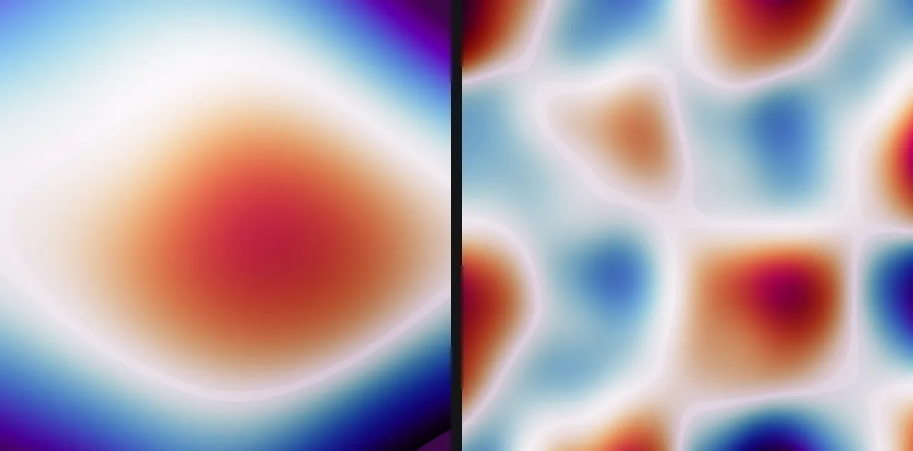
It took a while to understand why. There were 111 modes ringing, but how far the plate moves drops off fast as notes get higher, so a bass-heavy song is basically just the lowest couple of modes sloshing back and forth. Sand doesn’t care how far the plate moves, though. It cares how hard the plate shoves it, which is acceleration, and acceleration favors the high notes. Switching what I drew let the high modes through and the blob broke into cells. That’s the right half of the image above.
That fix created the next problem. The lines between cells move at the speed of the interference between notes, which is way faster than 30 frames a second, so the video buzzed like a fluorescent light. The honest fix is to do what sand does: average the shaking over time and draw where it settles. That calmed it right down. It also turned a Chopin nocturne into a donut.
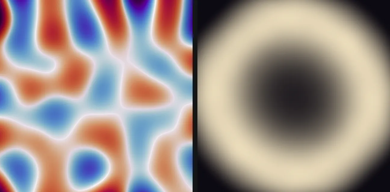
This is the tradeoff I keep running into. You can have intricate and frantic, or calm and blobby, but a real song won’t give you intricate and calm at once. Crisp Chladni figures need one dominant tone, which is why most viral cymatics videos use a pure sine wave and not, say, Chopin. Genre matters too. Piano came out clean and legible. Acid techno came out as mush, which I’ll note is also how it feels in person.
The thing I actually wanted from the start was for volume to matter. Play a song quietly and loudly and you should get two different pictures. A plate can’t do that, since everything just scales up together. Water can. Shake a shallow dish and nothing happens until you pass a threshold, and then the surface erupts into a pattern at half the drive frequency. Those are called Faraday waves.
I compared a few approaches, picked one, then built it in phases with tests gating each one. The water sim models a 5 mm deep dish with 994 surface modes, and seven validation tests pass, including that threshold (within 6.2%) and the half-frequency response (exact). The test I wish I had is the one that checks whether the stripes, squares and hexagons show up when they should. That part isn’t validated yet, so treat the patterns as plausible, not proven.
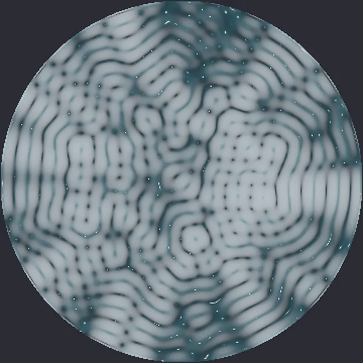
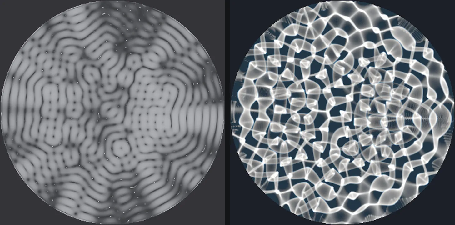
Then I wrote renderers for it. One makes the surface look like liquid metal. Another traces light rays through the water and onto the floor of the dish, the way sunlight dances on the bottom of a pool, with each color bending a slightly different amount so the edges fringe like a rainbow. My first test assumed the dips in the water would focus the light. It’s the crests. The crest test focused light 53 times brighter than flat water, and the renderer runs about a third of a second per frame. It’s the first output since the fake one that I’d hang on a wall.
The plan was always to send these into ComfyUI next. I wrote an exporter that turns each frame into the depth and surface-angle images ControlNet uses to steer an image model, installed ComfyUI, and set up comfy-pilot to drive it. Then I never made a single image with it. The project notes from that week say generative models can’t faithfully represent exact data and that’s a renderer’s job. Apparently I also wrote the “no guessing” rule in bold for a reason.
The last real change was July 1. The physics folder alone holds 15,880 files and 1.6 GB, mostly frames of things being slightly wrong in new ways. The demo I most want to see, the same song at 20 dB and 100 dB side by side, is still a line in a to-do list.
The first version chose the patterns and let the music take credit. Now the music chooses, and sometimes it chooses a donut.
Still a work in progress. Things got busy, so I can’t focus on this one right now.